Lightning Demos from Phase 1: Understand + Define.
Interactive Media and Communications
Interactive Media and Communications
The Google Sprint and Design Thinking Sprints are proven processes for answering critical business questions through design, prototyping and testing ideas with customers. This Design Sprint report was created for ICM 516: Design Sprints.
To bring this team's digital personal finance app, WalletWize, to life, they conducted a Design Sprint, a method originally developed at Google Ventures. The Design Sprint offers a focused, time-constrained framework for tackling complex problems through ideation, prototyping and user testing. Over the course of several weeks, they adapted this model to fit their team’s schedule and workflow while following its core principles.

Interactive Media and Communications
School of Communications

Interactive Media and Communications
School of Communications

Interactive Media and Communications
School of Communications

Interactive Media and Communications
School of Communications

Interactive Media and Communications
School of Communications
In today’s fast-paced and often overwhelming financial landscape, empowering individuals to feel confident in managing their money is more vital than ever. With this in mind, our team set out to design WalletWize, a digital personal finance app aimed at helping users take control of their spending, saving, and financial decision-making through an intuitive, user-centered experience.
To bring WalletWize, our digital personal finance app, from concept to prototype, our team employed the Design Sprint methodology—a structured, fast-paced framework developed by Google Ventures and detailed in Sprint by Jake Knapp, John Zeratsky, and Braden Kowitz. We also drew upon Pattie Belle Hastings’ The Sprint Handbook to navigate each phase of the process with clarity and intention. Designed to tackle big problems and test bold ideas in a condensed timeframe, the Design Sprint allowed us to align as a team, generate innovative solutions, and quickly validate our ideas through prototyping and user feedback.
While the original Design Sprint unfolds over five consecutive days, we thoughtfully adapted its structure to accommodate our extended timeline, ensuring each stage—from mapping challenges and sketching solutions to storyboarding, prototyping, and user testing—was given careful attention. Alongside qualitative insights gathered from user interviews and feedback sessions, we incorporated quantitative data and in-depth analysis to assess feasibility, usability, and overall impact. This combination of human-centered design and data-driven validation enabled us to build a prototype of WalletWize that not only reflects our users’ needs but also provides a clear direction for future development.
The Design Sprint offers a focused, time-constrained framework for tackling complex problems through ideation, prototyping, and user testing. Over the course of several weeks, we adapted this model to fit our team’s schedule and workflow while following its core principles.
The process is broken into five phases:
As part of the early stages of our Design Sprint, our team created a user map to visualize how a typical user might navigate through the WalletWize app. This exercise helped us align on the core structure of the user experience and identify the most critical touchpoints in the journey.
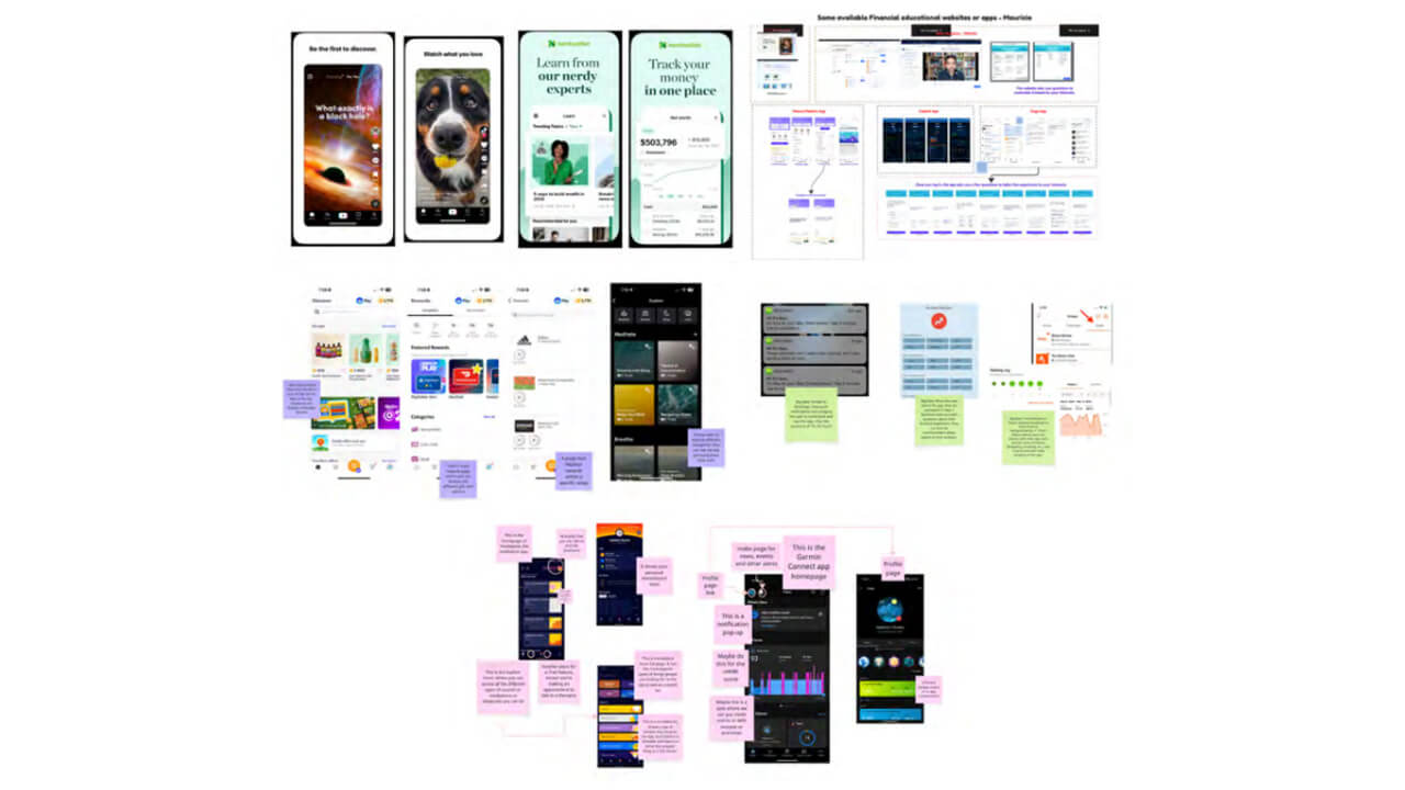
To spark inspiration for our app’s features and functionality, our team conducted Lightning Demos, a research activity aimed at identifying effective features from existing digital products.
To transition from research to ideation, our team completed the 4-Step Sketch process, a structured activity designed to help generate thoughtful, visual solutions for our app. Each member worked independently through the four stages, following the "together alone" method to ensure that we each had the space to think creatively without group bias.
Each team member contributed a few potential names and color schemes to our shared Miro board. Once all the options were presented, we conducted a dot voting exercise to narrow down our choices. After a round of thoughtful discussion and voting, the name WalletWize was the clear favorite. We felt it struck the right balance between being catchy, modern, and aligned with the app’s goal of promoting financial literacy.
We then turned our attention to the color palette. Multiple palettes were proposed, and after reviewing them together, we agreed to make a small but impactful adjustment. The final color scheme reflects a sense of energy, clarity, and approachability. This step helped us define the app’s visual identity.
To evaluate our solution sketches and move forward with the most promising ideas, our team used a series of voting methods designed to encourage both individual input and group consensus.
This included:
Next, each group member created a six-step user flow illustrating how a user might navigate through our app from start to finish. These flows mapped out a basic journey, identifying key actions such as onboarding and selecting content
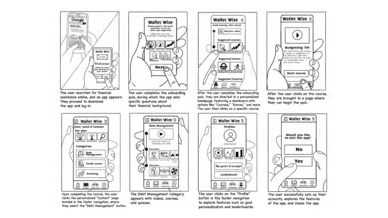
To prepare for prototyping, we expanded the selected six-step flow into an eight-frame storyboard. This storyboard outlined how the user would interact with each screen of the app in sequence, providing a visual and textual narrative of the experience. Each frame represented a key step in the user journey.
During this phase, our team identified the key elements required to develop an effective prototype. Our goal was to create a realistic, testable version of the chosen solution(s) and collect meaningful feedback from real users during the next stage, the testing phase.
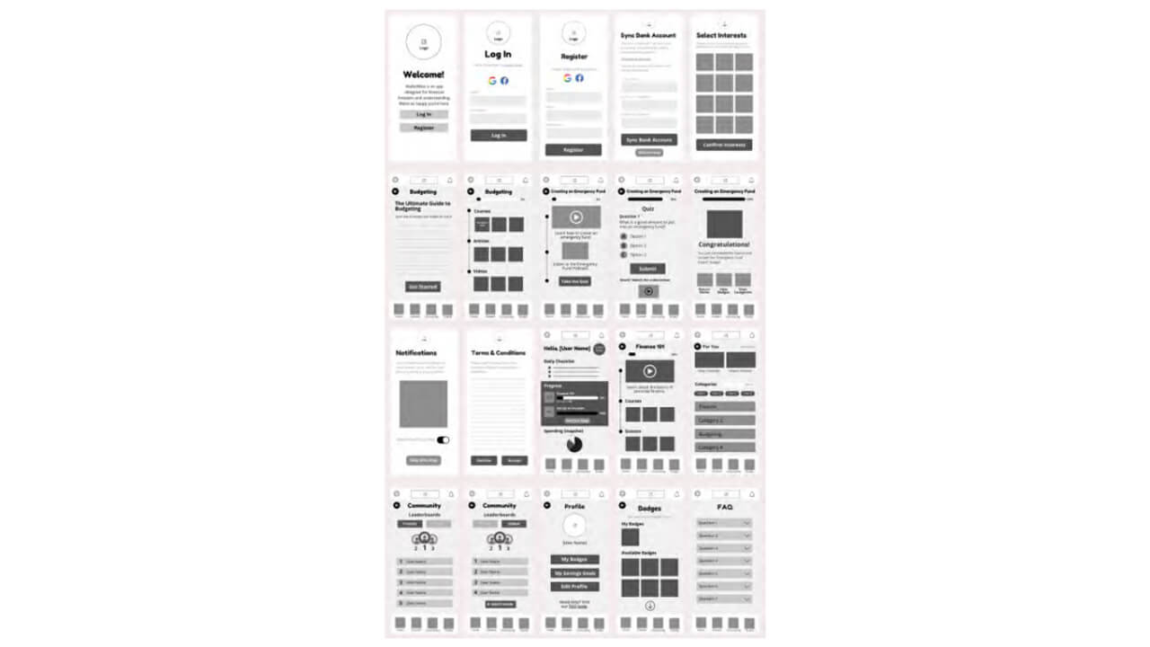
We used low-fidelity wireframes to visually organize and plan the solution before moving on to detailed design or prototyping. These wireframes allowed our team to establish the layout, hierarchy, and flow, focusing on structure rather than colors, fonts, or detailed visuals. The most significant advantage was the flexibility to make changes quickly; we could easily modify existing flows or create new ones.
Later, using these wireframes as a guide, we built a high-fidelity prototype in Figma, with detailed mockups that featured typography, colors, iconography, and content for each section within the app’s layout. These mockups were turned into an interactive prototype by connecting all the screens with smooth page transitions. These effects provided a realistic experience as users navigate through the prototype.
Once our high-fidelity mockups were finished, all buttons, links, and navigation items were linked with interactive transitions between screens. This final interactive version allows us to create a fully navigable prototype for the next phase: testing and collection.
View the Interactive Prototype
Finally, during this phase, the team conducted a trial to verify that all elements of the prototype were well-designed. For this important step, we acted as app users to identify mistakes before conducting actual user testing.
To better understand our users and gather meaningful feedback on the WalletWize prototype, our team designed both pre- and post-user testing surveys using Google Forms. These tools helped us collect valuable background information and evaluate the overall user experience both qualitatively and quantitatively. The pre-survey was shared with each participant prior to their scheduled test session.
During our testing session, each team member followed a script outlining all interactions with the user. This script included an introduction by the interviewer, the tasks for the user, and final questions to collect feedback from the user.
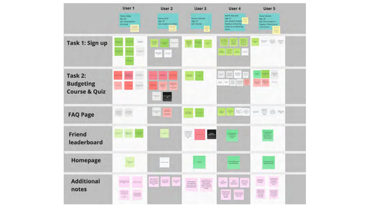
During our user testing, we gathered user feedback on a Miro board as users navigated through our prototype, working to complete the assigned tasks. This feedback was organized into categories using sticky notes: red for negative feedback, green for positive feedback, gray for neutral feedback, black for not completing the task, and pink for additional comments.
Once the five interviews were completed, we immediately proceeded to organize the collected data to identify patterns and common problems faced by users during testing. We identified several pain points where users experienced difficulties with our prototype:
We analyzed objective quantitative data collected during user testing, which highlighted specific areas for improvement. Such as:
Lightning Demos from Phase 1: Understand + Define.
The finalized storyboard from Phase 2: Decide + Storyboard.
Low-fidelity wireframes from Phase 3: Prototype + Refine.
Organization of findings from user testing in Phase 4: Test + Collect.
During our design sprint testing phase, we uncovered some valuable insights. This key data will guide us in refining our prototype.
The users gave positive feedback about the app. They were satisfied with their experience and found the app to be intuitive and educational. All users reported confidence in using the app without assistance. The main strengths of the app were its overall design, including its color scheme, and its intuitive screen navigation. The post-test Google survey results show that all users found the app easy to use. Additionally, all users expressed the belief that Gen Z users would learn how to use the app quickly with no expected difficulties.
Further analysis of objective data collected through key performance indicators revealed some areas for improvement. We found that general and nonspecific tasks, such as signing up and managing friends in the app, were straightforward and seamless. We can assume that Gen Z users are familiar with those tasks from other popular apps.
However, when it comes to app-specific tasks, such as locating a specific financial course and accessing a question board page, the results were less encouraging. Here, we observed a suboptimal success rate, a significant time gap in task completion compared to references, and a large user standard deviation. These results highlight the need to revise the user flow for those tasks, add appropriate links on the main homepage, and modify navigation to target pages to improve the overall user experience.
Interestingly, we observed some variability in the test user sample, as task failure was not specific to individual users. Although the average app usability score was sufficient, simplifying app-specific user flows may be necessary due to the heterogeneity in Gen Z users’ skills.
Lastly, the main question that arose during our preliminary research phase was whether Gen Z would use an app that aims to provide them with financial skills and knowledge. When specifically asked whether they would use this app in the future, all users declined to choose the “very frequently option” and committed to only occasional use. Taking into account some bias in user response, possibly aiming to please app developers, we found this data somewhat concerning. Perhaps there is a need to modify this app and add some more elements that appeal to Gen Z to increase its use post-launch.
Overall, the app received very high scores in most areas and was well received by the Gen Z user sample. These usability studies identified some key elements that need to be modified to ensure adequate user experience.
As we proceeded with our user testing, we had a few goals that we hoped to achieve before the test began. The goals we listed out were the following: to conduct our interviews with our test participants as unbiased as possible, validating if our app would be able answer the question we established at the beginning of our sprint, and be able to gather data (both quantitative and qualitative) to edit our app as needed through the users’ point of view. Once the test began, we had four tasks for each of the participants to complete.
After each participant went through the entire test, we were able to walk away with data that gave us clear insights into what was working in our app and what were problem areas we would have to take back to the drawing board to reiterate.
During Task 1, our participants rarely had issues signing up for the app itself. Some of our participants, however, chose not to attach their bank information, which was previously discussed as a possibility when adding this feature to our app. Some users may not feel fully comfortable connecting their bank information to a new app until they are comfortable with the brand and the app itself.
Task 2, which was to complete the budgeting course and the emergency fund quiz at the end of the module, was one of the problem areas our participants struggled with. The participants expressed to us that it was hard to navigate to the correct quiz/module, and many clicked on our Finance 101 course directly through the homepage of our app rather than utilizing the content icon located at the footer of the app to find the
budgeting course.
For Task 3, 4 out of 5 of the participants were able to find our friend leaderboard. Most of our participants were then able to navigate to the FAQ page with ease. There was a suggestion from a participant to move our FAQ page to the homepage of our app.
Overall, we received insightful and mostly positive feedback from our Participants. The most notable feedback was that they liked the design of the app, along with the color scheme, and the layout of the app makes sense. The areas of improvement proved to be organizing and making navigating to the modules and quizzes in a more intuitive design, and moving our FAQ to a more visible space in the app.
The WalletWize app was brought to life through a collaborative, user-centered design sprint. During the sprint our team emphasized the importance that thoughtful iteration and feedback has on the sprint process. The process allowed us to move from conception to a working prototype in the matter of just a few weeks. We combined our individual ideas, brought on by the concept of working “together, alone”, and created a cohesive and engaging financial literacy app targeted at Gen Z.
By working through the sprint framework, we aligned ourselves to one shared vision and clear, actionable goals early on. We each contributed a unique perspective and skill set based on our backgrounds and careers; UX and market research, visual design, content writing, and prototyping. Throughout each phase of the process, we communicated and planned effectively to build an app that felt intuitive and useful.
By testing the app on five Gen Z users, we were able to validate that WalletWize’s core features such as as; account setup, the daily financial checklist, and the friend leaderboard were easy to find and use and enjoyable. Most of the users liked the welcoming interface, easy navigation, and appealing color palette. There were some struggles to find specific content like the emergency fund quiz, but the feedback gave us actionable insights to improve the WalletWize experience. The other suggestions to make in-progress courses more visible and to move the FAQ to the homepage would further enhance the app’s usability.
The sprint process also encouraged us to think past what can be done during the time allocated for the sprint. With more time and a dedicated team to the app’s development, WalletWize has the potential to evolve into a full-fledged tool that empowers young adults to better their understanding of financial literacy. Features like the interactive courses, real-time savings goal, and the gamified badge system provide motivation and structure to learn important money skills.
Most importantly, WalletWize demonstrates that an organized, user-centered approach can yield powerful results despite time restraints.
The app supports our key objectives:
With further development and refinement, WalletWize has the potential to become a valuable, accessible resource for young people navigating their personal finances during the digital age.
The Design Sprint is an innovative process to ideate, prototype, and test products quickly and efficiently. This process offered our team a structured, fast-paced, and collaborative framework to turn an idea into a tangible product. Throughout the Sprint, we conducted research, sketched ideas, created mock-ups, tested our interactive prototype with Gen Z users, and reflected on our data, all important steps to bring WalletWize to life.
During this experience, we learned to embrace ambiguity, think creatively, and communicate effectively as a team. From sketching early concepts to facilitating user interviews, every step challenged us to listen, adapt, and support one another. We also gained hands-on experience in facilitation, user-centered design, and testing strategies that are directly applicable to future professional environments.
This process not only resulted in a working prototype; it also fostered strong collaboration, encouraged us to lean into our individual strengths, and taught us the value of clear structure and open communication.
Thank you to our dedicated team, our Sprint facilitators, and the users who participated in our testing sessions. Your insights, feedback, and support were essential to making this project a success.
"This project has helped me refine my project planning process and made it faster and more in-depth. It taught me that it's okay to unplug while researching, and to limit distractions from outside the project. Design Sprints are a magnificent tool that should be considered for any business or organization looking to refine their processes." - Isabella Susino, MS '26
"As a future UX/UI designer, this project taught me the value of teamwork and the ability to achieve great digital solutions within less than a week of team effort." - Mauricio Zúñiga, MS '26
This serves as an overview of the project and does not include the complete work. To further discuss this project, please email Isabella Susino, Christian Schaaf, and Mauricio Zúñiga.
The Google Sprint and Design Thinking Sprints are proven processes for answering critical business questions through design, prototyping, and testing ideas with customers. In ICM 516: Design Sprints, students will learn to facilitate product design sprints using these processes while experiencing a key role on an interdisciplinary, collaborative sprint team. This course covers facilitation best practices (remote, hybrid, and in-person) and a variety of sprint workshop methodologies and tools. Students complete a portfolio quality case-study of the sprint experience to use for employment purposes.
We've sorted each of our undergraduate, graduate and doctoral programs into unique Areas of Interest. Explore these categories to discover which programs and delivery methods best align with your educational and career goals.